
COFFEES IN THE WORLD
Many people love coffee, but how much do they know about the coffee beans that create that perfect cup of coffee? We aim to change that through the use of our ‘scrolly-telling’ visualization!
“I would want to compare the different coffees from countries and other aspects of those countries from my favorite coffee places” - Coffee lover from our interviews

This image shows a green colored matcha latte.
PROJECT SUMMARY
This web tool would educate users on different attributes in coffee and give them a deeper insight into coffee beans from all over the world. This project was highlighted by the Professor, Dr. John Stasko, in his Fall 2019 class. Here is a snippet from his article that references our project, and here is a link to the project.
Project duration: August 2019 - December 2019
Roles: UX Strategy, Content Lead, Project Manager.
Key Methods
Storytelling
Different Information Visualization Techniques used through the project (Frequency plot, MDS, Parallel Coordinates)
Various Interaction Methods such as Select, Zoom, Click, Filter, Brushing, Scrolling, Tool-tips
MY ROLES & RESPONSIBILITIES
I was the Content and UX Strategy Lead for the Project, where I led the content strategy for our visualization project. The team discussed and converged on various visualization techniques together, and I led the user research to inform these visualizations.
I also led the project management where I created a project timeline, and kept the team on track to meet each deliverable.
Video: I created the video for our demo, using VideoPad Editor.
OUTCOMES
DEMO
We used story-telling combined with various visualization techniques such as frequency graphs and parallel coordinates combined with MDS to create an exploratory experience for coffee lovers. Click here to view the Project.
Here is a video that showcases this Coffee Visualization Project!
TEAM RECOGNITION
Our Project was highlighted by the Professor, Dr. John Stasko, in his Fall 2019 class. Here is a snippet from his article that references our project
“On the narrative/storytelling side, one of my favorites showed coffee beans from around the world and their characteristics. And this one easily could be characterized as an analytical visualization as well because it contains multiple highly interactive components that allow the viewer to explore this rich data set about coffees.”
- Dr. John Stasko, Director of the Information Interfaces Research Group

This image shows a twitter post by John Stasko, and the article is linked above.
RESEARCH
DATASET

This image shows a snapshot of the dataset with different columns.
We began with selecting a data set. This data-set contained reviews of 1312 Arabica coffee beans reviewed by Coffee Quality Institute's highly trained individuals. I do not own this data neither have I scraped this data, and this data-set was obtained from Kaggle and can be found here.
These included: 312 data cases (data-set 1, Coffee Beans Review with specific information like country of origin, acidity, flavor, etc. ) and 227 data cases (data-set 2, Countries of the world with specific information like country name, region, climate etc.)
We cleaned and pruned these datasets and combined them into one single data set.
USERS
Based on our preliminary research we identified the following user groups:
People who love coffee.
Potential investors for the coffee industry.
People who are curious travelers & want to learn more about other countries.
Note: Due to time constraints for this project, the user research was limited and conducted with a small sample size.

This image shows 2 hands holding a small cup of black coffee.
GOALS AND QUESTIONS
Based on our limited user research, we finalized the goals and questions for this visualization.
These were a couple questions our visualization aimed to answer:
What country features appear correlated with high coffee ratings? For example are there climate similarities among countries with highly-rated coffee? Are there other factors that form a pattern?
Which country (or countries) could potentially become a NEW manufacturer for best-rating coffee based on existing countries with high ratings?
With coffee, are there correlations among ratings of different dimensions (say, aroma, flavor, aftertaste, and acidity)?
We created an analytical visualization with multiple highly interactive components that would allow the viewer to explore this rich data set about coffees. It would also provide the user with some fun-facts about different attributes and allow for learning through exploration and interaction.
FINAL DESIGN
INTRODUCTION
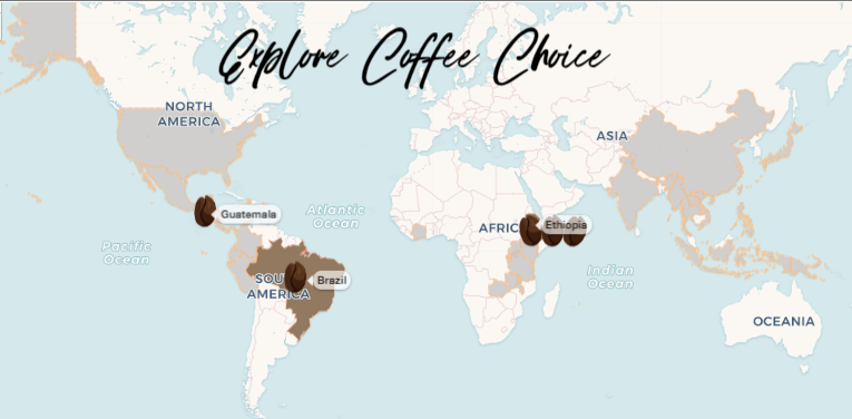
This image shows a working model of the data visualization website.
We introduced users to this data-set by allowing them to manipulate a map visualization that updated dynamically as they changed each attribute. (see image on left).
JOURNEY THROUGH COFFEE ATTRIBUTES
We then took the user on a journey through coffee attributes that were presented in an interactive way. This viz was exploratory and one could follow individual data-points of the data set, that represented a coffee from a country, to observe their journey through various attributes like Flavor, Aroma, Acidity etc.

This image shows a working model of the data visualization website.
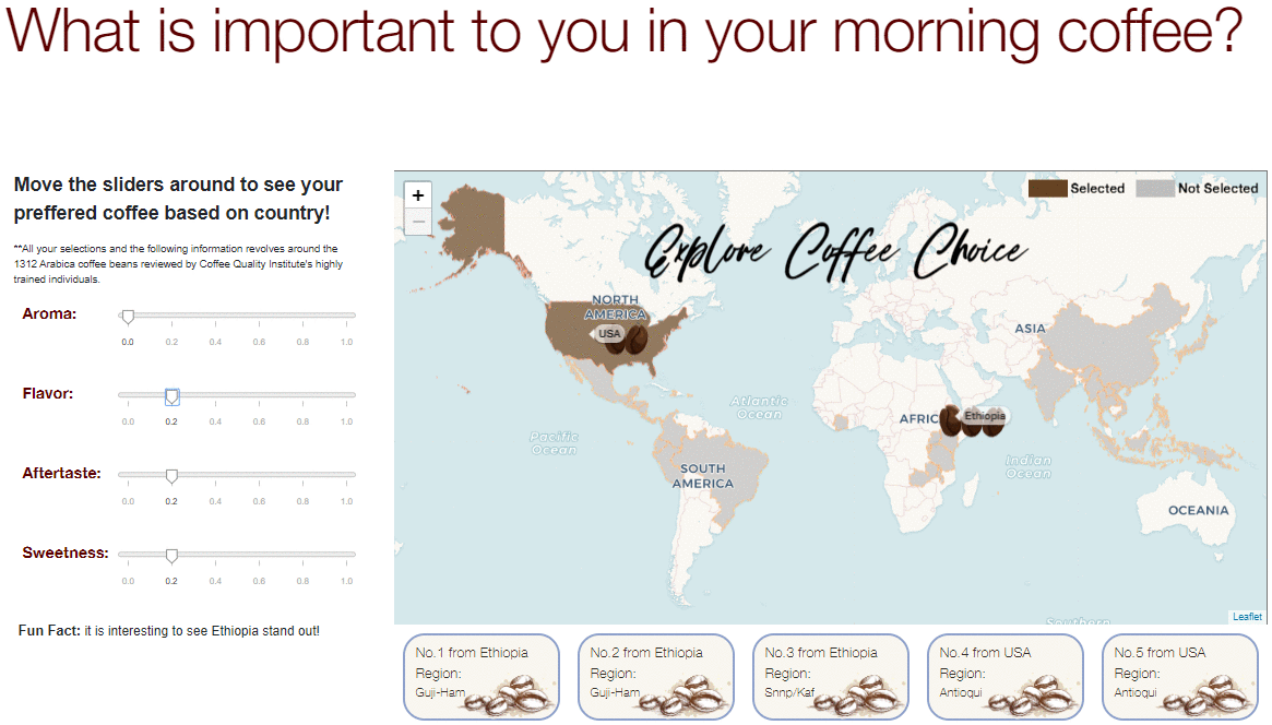
EXPLORING THE DATA SET
The journey ended with an open-ended exploratory visualization with multiple interconnected visualizations that included a world map, an MDS embedding viz (representing the high-dimensional data in 2-dimensions, where distance between dots indicates similarity between coffee beans), and a parallel coordinate view (which could be toggled to switch to a histogram view). These are connected via brushing and linking where one can select a country in the world map, and this would update the other views. We can also further update the selections by brushing in the other views.
Click here to explore now!

This image shows a working model of the data visualization website.